Mapping the skin microbiome of Radiolab listeners.
SUMMARY
I helped the gut-testing startup uBiome avert a marketing disaster by overseeing a design overhaul of its consumer platform.
MY ROLES
Product Strategy
Senior Product Designer


The state of online results when I first started at uBiome. It was completely broken on mobile.
A mistake leads to an opportunity.
In June of 2017, uBiome contributed to an episode of Radiolab called Funky Hand Jive, where a skin microbiome exchange (otherwise known as shaking hands) was performed for the radio broadcast.
During the show, uBiome offered free microbiome skin-sampling kits to the first 1,000 listeners. The problem was, nobody was keeping track of our online store, and once 1,000 kits had been purchased….more were purchased. And then more. And then more.
By the end of the week, over 100,000 listeners had requested free sampling kits! And all of them were impatiently waiting for the free kits to arrive to their homes.
After an initial (internal, and mostly marketing) freak out, we decided to use this overwhelming response as an opportunity to turn a looming disaster into an opportunity: to delight customers and upgrade uBiome’s platform at the same time.
Until now, the Explorer platform had been a Frankenstein of code and design, with a focus on the gut microbiome (not skin). It was in desperate need of UX and UI improvements. Inconsistent navigation only lent to the confusion, and we knew it was going to be difficult for Radiolab customers to find their skin results. Our solution: we would build a brand-new, single page within the platform where all skin data would be congregated specifically for Radiolab customers. And we needed a design refresh.
Getting started.
After speaking with the lab to factor in results processing time, we agreed on a four-week turnaround: one month to plan, design and execute a new section of results within the Explorer platform.
Day one was an intensive brainstorming session between myself, the head of bioinformatics and our lead U.S. developer. What kind of data would we be working with? Rather than copy and paste data models from other sections of the Explorer platform, could we try something new? What were the department goals?
Together we sketched out ideas, created MVP goals as well as a wish list, and determined limitations. Working closely with other department heads was hands down the most important and enlightening part of this project for me. Because of the tight deadline, we simply didn’t have the time to make any big mistakes. Designing in a silo wasn’t an option (nor should it ever be).
I spent the first week sketching, wireframing, and rapid prototyping. I shared interactive prototypes of wireframes at the beginning and end of each day, sending Invision download links directly to my coworkers’ mobile phones. Allowing scientists and engineers to tap around on their own devices brought them that much closer to the project, and increased our communication twofold.
Notes from the brainstorm….along with some chocolate (which makes everything better).
Beginning sketches, after consulting with bioinformatics and engineering.
Project goals & limitations.
From our initial brainstorm, we were able to come up with clear goals and limitations for the project as a whole, and for each department. I typed these into a document that was shared and reviewed before each meeting.
Design & Product: Use the project as a testing ground for new features and styles (data visualizations, colors, interactivity) and optimize for mobile (Explorer was currently broken in mobile view).
Bioinformatics: Use machine learning in the form of a predictor, compare users to a specific cohort (rather than our entire database), and increase our database by asking Radiolab users to complete a mini survey ( one question).
Development: Improve and clean up the code (the original code still existed and hadn’t been updated in years), and introduce an A/B test.
Marketing: Educate users about over-time testing, and push them to sample again. One recurring issue at the company was that over 90% of our customers didn’t sample more than once. Because marketing did not have a large budget, I also suggested incorporating a share feature (organic marketing) into the design.
Machine learning: predicting your state based on you skin.
Based on geographic locations of results, our map visualization displayed each state’s skin microbiome profile. To incorporate machine learning into the project, customers could ask us to predict what state they were from, based on their unique skin microbiome profile.
I saw great opportunity to add even more interaction on the prediction page, and to cross off a number of our goals (listed above). Once the user clicked or tapped “Predict for me!”, we knew we had their full attention. So on the next page I added:
The share feature: Once we predicted what state you were, we surfaced our share feature. We were still learning about our customers, and trying to understand who they were. By monitoring their social media responses to our prediction, marketing felt there could be opportunity for future campaign ideas.
The mini survey: By asking them if we got it right, we were adding information to our database. From an empathic standpoint (and yes, I had to guess at this, because we had no time or budget for usability testing), I decided that whether the information was right or wrong, a user would feel compelled to answer (wow, it’s right! how cool! and nope, you got it wrong. but you must know this is a possibility, since you’re asking). The reward was a thank you note, educating the user about citizen science.
Thank you / CTA:
Testing whether to hide the CTA behind another action vs. keeping it consistent at the bottom of the page.
A/B testing.
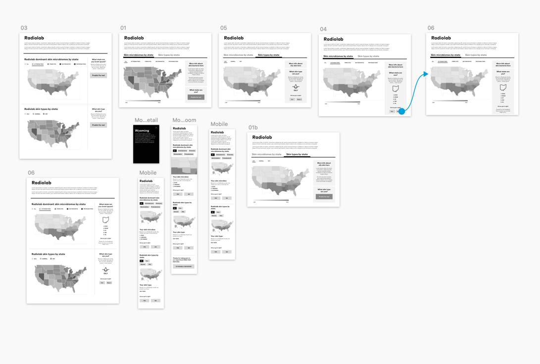
My initial designs hid the “sample again” CTA behind the survey (top image). Marketing had some hesitation about this, so we decided to use A/B testing to try out another path (bottom).
Some of the early wireframes used for prototyping in invision
Wireframing.
My method is to bring wireframes into invision and make them clickable as soon as possible. Here’s where I began playing with prototyping in sketch and Invision. The all-black modal screen was dramatic in the wireframes, but I liked the break it presented from all the light grays. I ended up keeping it for the final design!
Optimizing for mobile.
This shows how I sat down with the lead developer to review a bit of how the page could be built. We needed to pay attention to other pages and the various languages being used for code (some older code I need to remember what was being used so i can mention it here). This was a way to map out design and development, to see how it would optimize for mobile. And what could and couldn’t be done. A very simplified way of looking at things (especially from a developer point of view), but allowed us to speak the same language and helped me to understand limitations.
Design deliverables included a basic style guide in Invision for engineers
Deliverables.
A simple style guide in Invision
I uploaded designs from Sketch into Zeplin
Invision prototype. as a reference for engineers
I also used Principal for any motion effects I wanted but. wasn’t able to explain easily to engineers
Reflections.
Once we started applying the actual data that was coming in from Radiolab samples, we discovered some shortcomings in the designs.
States with too few samples (left image, below). Our data scientists had created a threshold - too few samples coming from one state meant our predictor tool/machine learning couldn’t be implemented.
International customers center image, below) . We completely overlooked people from outside of the U.S. who listened to the podcast and bought our kits. We had to make a last-minute decision and decided to be inclusive. and another design quick-fix was needed.
My original map design was much more detailed (right image, below) . I had each state broken down by county, without fully realizing it. It just….looked prettier that way, and I failed to take a step back to realize our data wouldn’t be that advanced.
In terms of our timeline, we were too optimistic. Every member of this team was on at least one other project, many of us were on more. With constant fires popping up in other products (this was a startup, after all), the Radiolab project ended up taking seven weeks to complete, not four. The result? Some customers had to wait up to three weeks to see their results, and they were not happy (and declared so on social media). In an age of instant gratification (Amazon same-day, Instacart, Fitbit, etc) it was already a lot to ask our customers to wait several days after purchase to receive their kit, then return their kit, and then wait another week for the results to be processed once reaching our lab. Tagging even more time onto that resulted in a less-than-ideal user experience.
All in all, despite the above issues, I deemed this project a success. I was able to set up a framework for an overhaul of the Explorer platform, and over a year later the Explorer design team continued to return to this project for ideas and inspiration.


