Branding for a fast-paced biotech company.
SUMMARY
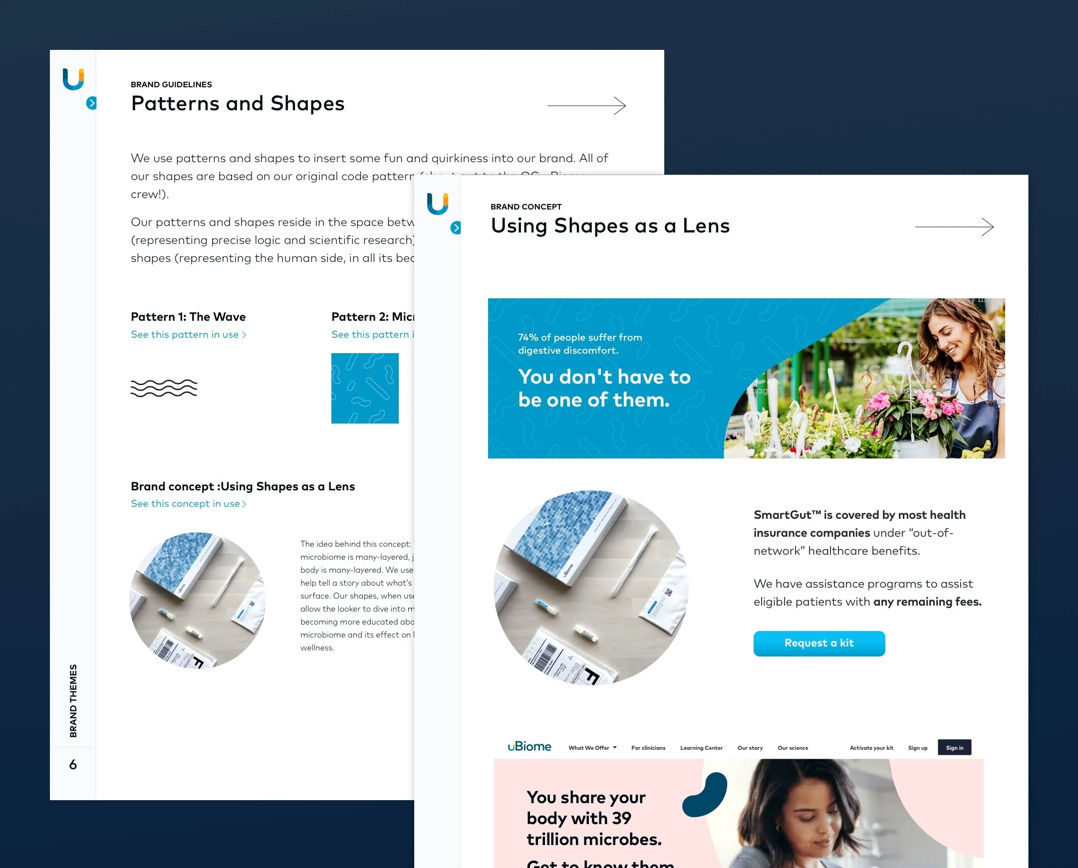
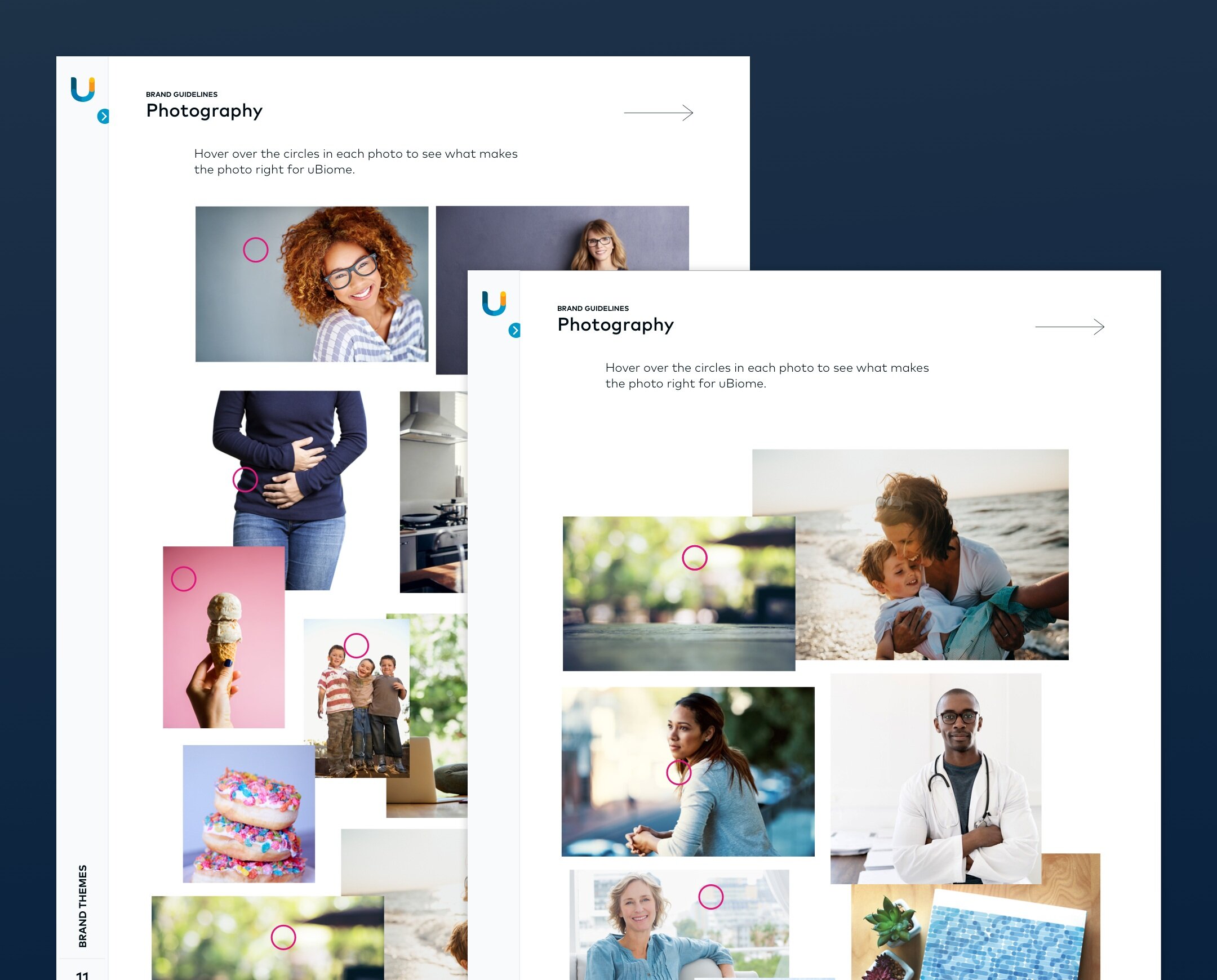
I worked closely with two senior visual designers to define and map out creative direction for the company. This included a style guide for marketing, in which we incorporated some of the design vision I had established on the product side, as well as a new kit design.
ROLE
Creative Director
Style guide.
What: I worked with two fantastic senior visual designers to gather together product and marketing designs over several months. We evaluated what was working and what was not (based on taste but also user feedback, including the ads that had the highest click-through rate on Facebook).
The challenge: We quickly discovered that design within the company had been going through an organic evolution. We liked where it was headed, but much of it was not adhering to the current style guide. In a fast-moving company with a high turnover rate (many contract designers had come in and out the door before I started), this is completely natural. My job was to encourage the evolution, while bringing back some of the order and best practices of the older style guides. .
The Solution: Over several months I developed a new style guide in Invision, which better represented where our company was, and where it was headed. I wanted us to appear more modern, and stand out from our competitors. Below are some highlights.


Microbiome testing kit: merging four into one
What: We had three products, each with their own kit. Before I arrived, the company chose to use color as a wayfinder for different products. Although I wanted to move away from that in the future, there wasn’t enough time or people power to institute an immediate change.
The Challenge: We were growing rapidly, with already one new product on the horizon. We knew there would soon be more. In addition to issues with color (what would happen when we had 10 products? 15? Would we really be able to have 15 distinct - not to mention nice to look at - colors for 15 different products?), there were issues in the warehouse; different kits needed to be stocked at different rates, because of demand. And with four different illustrator files floating around, we began to grow concerned about how to track and manage changes to the master files.
The Solution: It was clear we needed one, generic kit. Our CEO asked us to experiment with stickers and wraps, as a way to differentiate products visually. Stickers were a “meh” solution, and the wrap was a no-go (different warehouses fulfilled different parts of the kit, which meant the wrap may need to be removed and put back on again - too much room for error). One day as I was perusing business card designs online, I came across a card that was die cut, and the solution hit me - we needed a peekaboo kit! The kit itself would be incredibly generic - simple white, with a white uBiome logo. But the die cut pattern would help it stand out, by giving it a modern twist. The instructions booklets would be fed into the kit, and would peek through to the outside, allowing customers and employees to know which product this kit belonged to. The CEO was very happy, as were the warehouse folks ;-).


Iconography
What: Our designs relied heavily on icons, but often the iconography was taking over the page. Lines and color were too heavy, and the style often missed the mark.
The Challenge: Creating an icon library we could use with clinical or consumer products.
The Solution: I evaluated every icon we were using throughout our platform and marketing site, and grouped similar icons together. I created a small and simple library, with a light and modern style, finding a balance between playful (consumer) and elegant (clinical).
Of Note: I absolutely love creating icons, and I love doing it in Sketch. Most designers use Illustrator, but I love the challenge of using a less-robust illustration tool. Below are some of the icons I created in our library, and how we chose to style them.

